
App Extensions
Uncover fresh, bespoke
Transform KPI reporting in Qlik Sense by adding flexible dimension support, dual layout modes, legend controls, and readability improvements that fit the way your modern teams analyze data.
Download now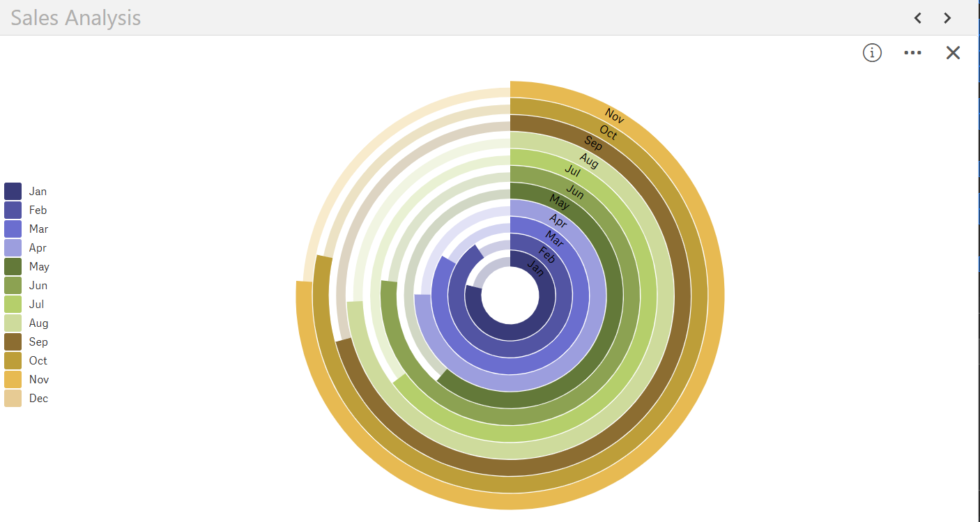
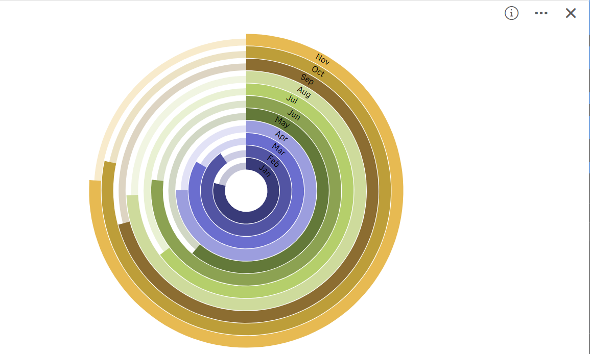
Break free from single-measure limits and choose the layout that fits your story. SenseOps supports dynamic dimension selection, allowing you to represent KPIs across categories or segments. Switch seamlessly between circular and radial gauge modes to match your dashboard design, from classical executive KPIs to bold operational metrics.
Access Documentation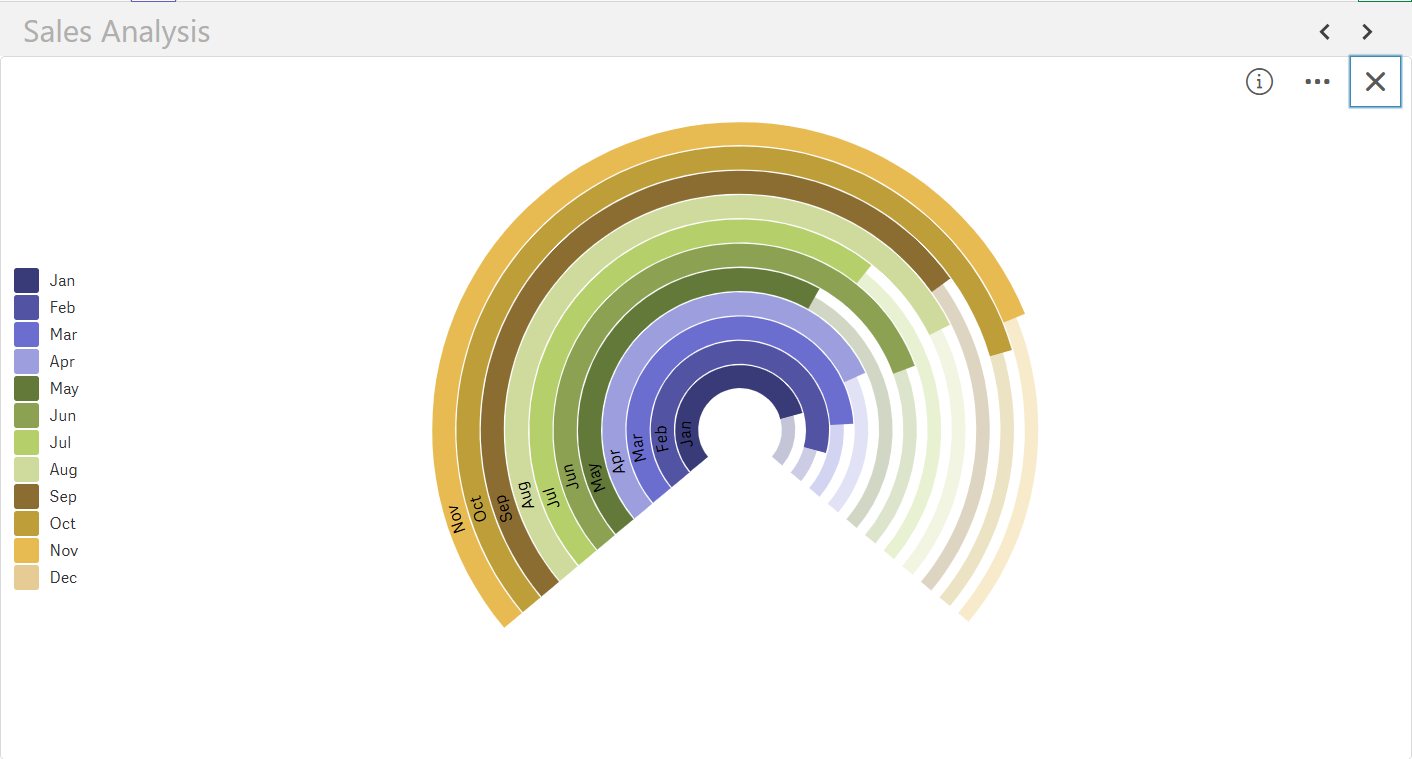
Fully control legend visibility and labels, reduce clutter, and highlight key insights without compromising context. Makes it easy to maintain readability even in complex multi-gauge dashboards, giving stakeholders the clarity they need at a glance.
Access Documentation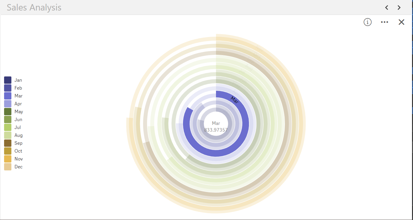
Enhanced readability with intelligent defaults, adaptive scales, high-contrast visuals & clear value labels. Whether for executive reporting or real-time monitoring, your dashboards communicate performance clearly, empowering quick, confident decisions.
Access Documentation
Exponential gains from Qlik Investments
All of Qlik's journey under one-roof
Accelerated adoption across teams
Fresh insights, powered by automation
© 2026 SenseOps Copyrights Reserved