
App Extensions
Uncover fresh, bespoke
Compare multiple measures, track changes over time, and build high-impact visuals that elevate every analysis. Customize lines, markers, tool-tips, and reference points to bring sharper context and meaning to your data.
Download now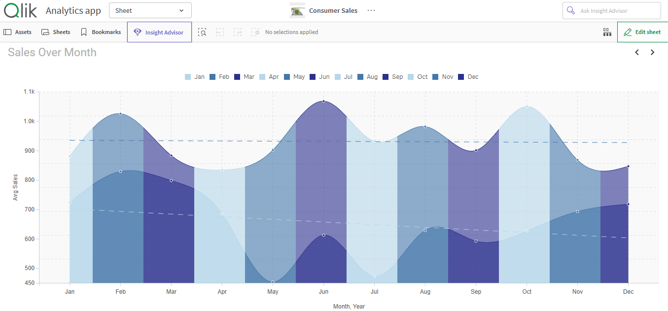
Uncover relationships across measures or time with sleek, trend-driven visuals. The SenseOps Line Chart lets you compare multiple data streams, surface patterns instantly, and tell richer stories without clutter.
Access Documentation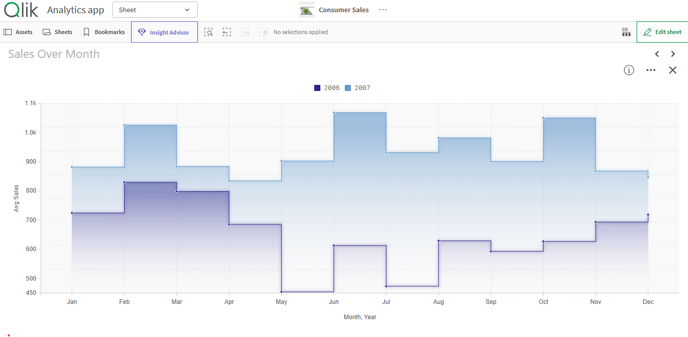
Design every aspect of your chart - Tweak line thickness, choose solid or dashed styles, define point size and color, all to match your dashboard’s look and feel. Your data should look as intentional as your design.
Access Documentation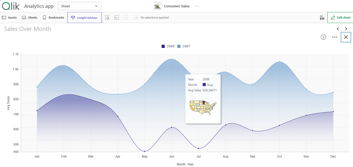
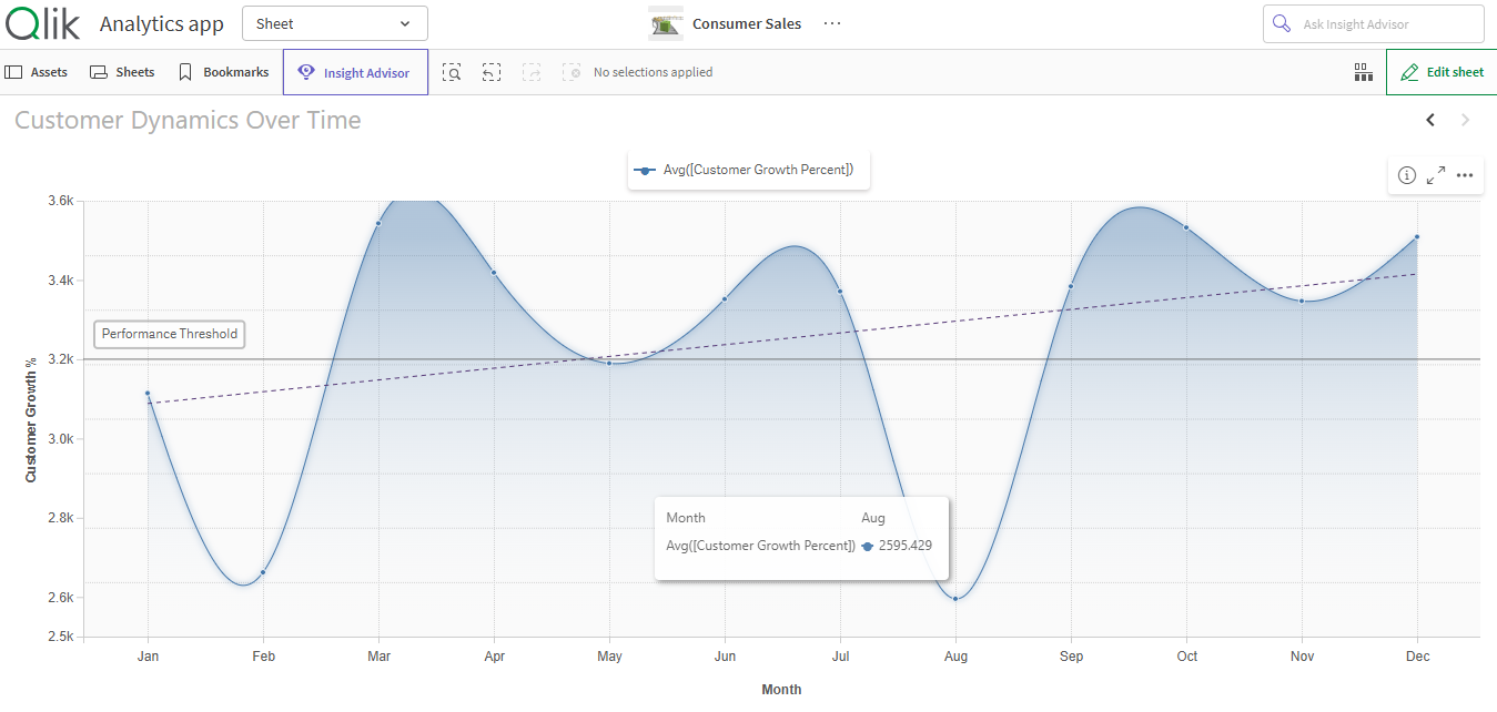
Highlight thresholds and targets with reference lines on both axes. For every data point, bring in row-level context using custom HTML tool-tips - deliver more than numbers, giving insight exactly when and where you need it.
Access Documentation
Exponential gains from Qlik Investments
All of Qlik's journey under one-roof
Accelerated adoption across teams
Fresh insights, powered by automation
© 2026 SenseOps Copyrights Reserved