
App Extensions
Uncover fresh, bespoke
Convert multi-step data into clear directional flows. See how values move across stages and quickly spot patterns or bottlenecks in your Qlik apps.
Download now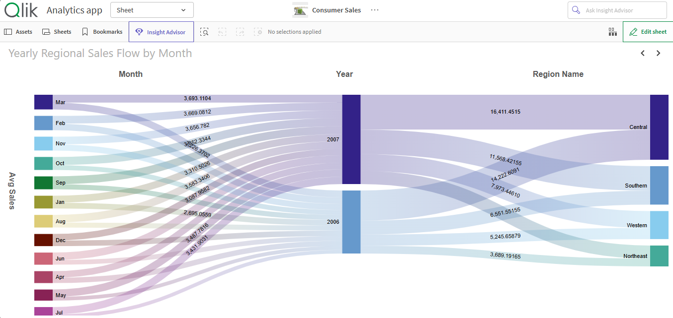
Order nodes by metric weight or custom logic to surface dominant flows and maintain a stable, repeatable structure across selections.
Access Documentation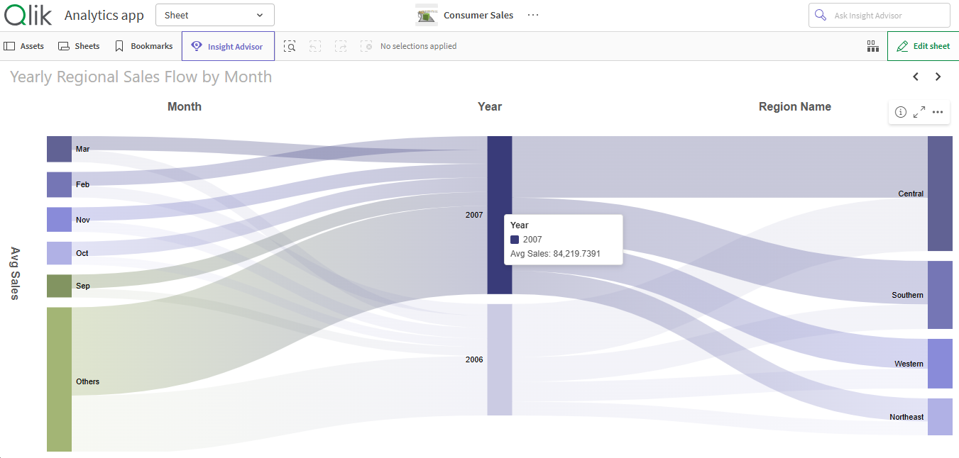
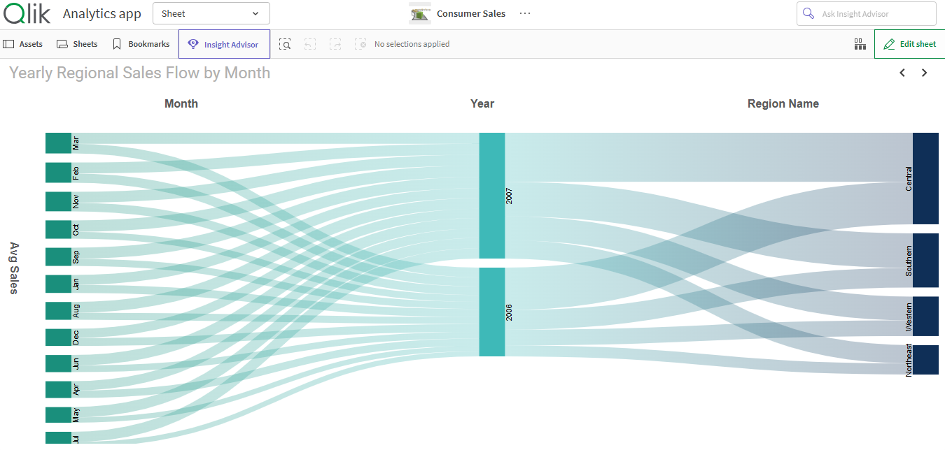
Set a maximum number of dimension values to display. Limit low-impact values, keeping the Sankey clean and focused on key data points.
Access Documentation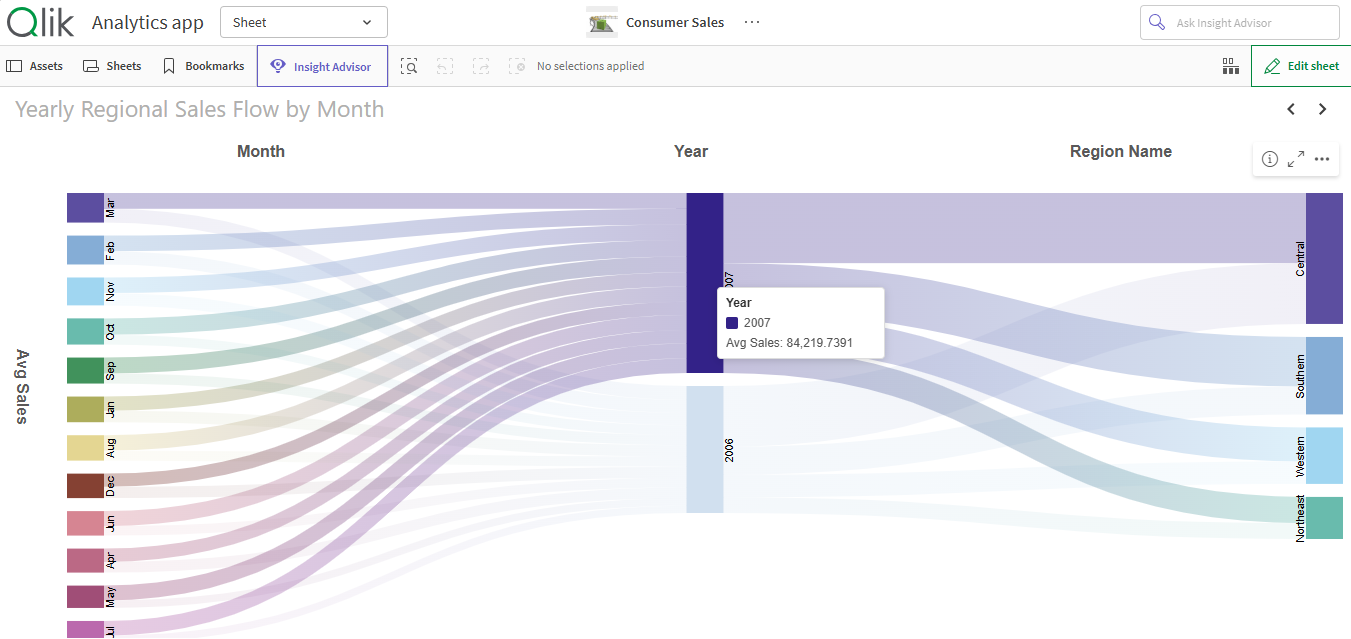
Customize every visual element - colors, spacing, label formatting, link width, and layout behavior. Build a Sankey that fits your app’s design while maintaining analytical clarity.
Access Documentation
Exponential gains from Qlik Investments
All of Qlik's journey under one-roof
Accelerated adoption across teams
Fresh insights, powered by automation
© 2026 SenseOps Copyrights Reserved